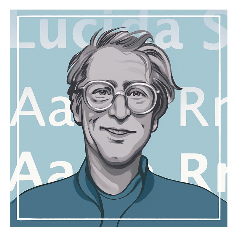
Most font fanatics — yes, they exist — know Chuck Bigelow is the man behind one of the oldest typeface families still in use: Lucida. Or, as you probably are more familiar, Lucida Sans, Lucida Bright, and Lucida Sans Unicode. He and his partner in typography, Kris Holmes, released the font in 1984. The name is intended to evoke the typeface’s lucidity; it’s known for clear lines and legibility as well as tall lowercase letters. The duo’s goal was to make text easy to read in a lower-tech era of printing.
At the time he co-designed Lucida and several other font families, Bigelow was a typography professor at Stanford University and a recent recipient of the prestigious MacArthur Fellowship, aka the Genius Grant. But before he rose to prominence as a type historian, educator, and creator, Bigelow was a native of Troy and a precocious Cranbrook student whose curiosity often led him to rebel against the institution’s regimented ways.
Bigelow, now 76 and writing a book called Our Work about his and Holmes’ body of font work, talked to Hour Detroit about his Michigan roots, how his love of writing and science led him to typography, and what qualities make a great font.
Hour Detroit: What are some of your memories from growing up in Michigan?
Chuck Bigelow: Until I was 3, my parents and I lived on my grandparents’ farm on Wattles Road in Troy. That area was all farms then. My first memories are of the countryside. In the wintertime, we’d go on sleigh rides pulled by my grandpa’s dappled white and gray horses. In a way, it was an introduction to a world that was on its way out. After that, we moved to a small neighborhood in Beverly Hills.
My parents sent me to Cranbrook because I loved science. I thought maybe I’d become a biologist. What I remember with most pleasure about growing up were two nearby museums, the Cranbrook Institute of Science and the Cranbrook Art Museum. My dad was an amateur artist and would take me to the art museum, and we would look at paintings and other works together. At home, my parents gave me Little Golden nature books, and because I read through them so fast, they gave me a junior membership to the Institute of Science.
What inspired your fascination with fonts?
When I was a sophomore in high school, I became rebellious. I was on probation for some misdeeds. I learned a lot, but Cranbrook was very restrictive and I wasn’t learning the way I liked. I used writing as an outlet. The Detroit News had a writing contest for high school students, and I won the grand prize: a typewriter. I went to Reed College in Oregon, which was sort of the opposite of Cranbrook — it was noted for its liberal nature — and I had a graphic arts teacher, Lloyd Reynolds, who was a calligrapher. To him, writing beautifully was part of civilization. People had spent thousands of years working out different ways to write. It wasn’t just about how to use a pen. My love of science always made me ask, Why? Why do we think one thing is more beautiful than another? So, I began to study that. Later, when I taught at the Rhode Island School of Design, I took summer night classes at Harvard to study computing. I thought, “This is the future.”
Tell me about developing Lucida. What were you and Kris hoping to achieve?
It was not easy. It’s like publishing — you design a type, and a company may or may not license it and sell it. A lot of them weren’t interested in it. Kris and I designed a typeface in 1977 called Leviathan for a special edition of Moby Dick, but our first digital type was Lucida, released in September of 1984, when I was 39. We thought the old types never looked right for printing on low-resolution laser printers. We called our font “Lucida” to suggest it was made out of light and clear. “Lucida” comes from the Latin word lux for light and clarity.
What makes a good font?
There are great fonts for different purposes. Partly it’s fashion, partly it’s technology, and partly it’s the function. What is it supposed to do? A font on a laundry detergent needs to be bold to look like it’ll beat the dirt right out of your clothes. In a novel, you don’t want the font to tell you anything other than what the writer is trying to tell you. It has to be modest. Generally, to me, a great font is easy to read. If it’s used a lot and endures for years, then there must be some good qualities. It must have polish, rhythm, and shapes that are pleasing to the eye.
Some fonts are controversial and others seem to die out. What’s in store for Lucida?
When Lucida Sans came out, it was darker than expected. The little bit of extra darkness was just right. We’d see variants of Lucida on junk food wrappers and in Paris on awnings of restaurants or on menus. It’s interesting — before digital type, no one cared about fonts. Now the public has strong opinions on it. They’re a little bit like public figures or rock stars or actors. Like Comic Sans — people either love it or hate it. I kind of like it. It looks like a comic book caption face.
Lucida continues to generate interest because it keeps changing and attracting us to new design ideas. We’re happy with it. Every 25 to 30 years, some font companies renew their fonts. I think, eventually, we’ll come out with a new one.
Some font bloggers hate on Lucida. What do you say to those critics?
Understandably, some people say, “What’s so great about that? It’s kind of plain.” To those people I have to say, “Well, you’re right.” It was designed for a certain era and a certain mode of expression. I don’t object to criticisms. When the telephone company was designing the range of signals that could be transmitted over the wires, they measured the frequency of human speech, and they came up with a bandwidth that was enough to capture the speaking voice. But it wouldn’t have been able to capture opera singers or Whitney Houston. In a way, we were trying to do that — limit the complexity.
Is there big money in designing a popular font? Do you get some sort of royalty? Do you even have to work?
It has changed over the years. There is money, but there’s not enough money to reward all of the people who do wonderful work. There’s maybe 100 times more people designing fonts than there were 50 years ago, so there’s more supply and the buyers of fonts have more to choose from. Sometimes you get royalties and those are great, because those last for years. For example, from several firms we receive royalties every quarter usually. It’s sort of like the residuals if you write a script for a TV show.
This story is featured in the October 2021 issue of Hour Detroit magazine. Read more stories in our digital edition.
|
|
|